CUMULATIVE FREQUENCY CURVE
Cumulative Frequency Graph , also known as an Ogive, is a curve showing the cumulative frequency for a given set of data. The cumulative frequency is plotted on the y-axis against the data which is on the x-axis for UN-grouped data.
Cumulative Frequency Graph
If we are
given a table containing continuous data, we can find a running total of the frequency. This is called Cumulative Frequency.
Height (m)
|
Frequency
|
Cumulative
Frequency
|
In context
|
|
|
7
|
7
|
7 people less than 1.4m
|
|
|
8
|
15
|
15 people less than 1.6m
|
|
|
22
|
37
|
37 people less than 1.8m
|
|
|
3
|
40
|
40 people less than 2.0m
|
|
We can
therefore plot a graph:
· The x-axis (horizontal)
will be Height(m)
· The y-axis will (vertical)
will be Cumulative Frequency
· We plot the numbers in red
· The graph starts at 1.2m,
because this was the lowest value
|
|
We can
now use this graph to estimate a number of key values
In this case
n=40 (the total number of people
Median: On a cumulative frequency
graph we find  value value
We can read this off
the graph to get 1.64m
Lower Quartile: On a cumulative
frequency graph we find  value value
We can read this off
the graph to get 1.48m
Upper Quartile: On a cumulative
frequency graph we find  value value
We can read this off
the graph to get 1.73m
From this we
can deduce the IQR = UQ - LQ =
1.73m-1.48m=0.25m
|
Histogram – the A/A* graph!
Suppose you
are given a table of continuous data (see below).
Given a
class eg.  the class width is the class width is 
In the table
below, you can see how the class widths change.
In this
case, we will need to construct a histogram to
represent the data.
In a
histogram, the AREA of the bars equals the FREQUENCY
To achieve this,
we need to calculate a value called the FREQUENCY
DENSITY
Height (m)
|
Frequency
|
class-width
|
Frequency density
|
|
|
5
|
0.2
|
25
|
|
|
12
|
0.3
|
40
|
|
|
15
|
0.3
|
50
|
|
|
2
|
0.1
|
20
|
We now draw
a graph with:
· Height(m) on the x-axis
· Frequency density on the
y-axis
|
The next section considers how to read
graphs to find an average
|
Finding the mean and median from a
frequency graph
A frequency graph to show
the frequency of scores in a test
This graph can be turned into a frequency table
Mark
|
Midpoint
|
Frequency
|
|
|
5
|
8
|
|
|
15
|
12
|
|
|
25
|
11
|
|
|
35
|
3
|
TOTAL
|
|
34
|
|
|
|
Frequency diagrams and polygons
Bar charts and frequency diagrams. Pie
charts are useful for showing proportions, but different types of chart
have to be used for representing other kinds of data. A number of these
charts are described in this section..This frequency diagram shows the heights of 200 people:
You can construct a frequency polygon by joining the midpoints of the tops of the bars.
Frequency polygons are particularly useful for comparing different sets of data on the same diagram.
Constructing a frequency polygon
Midpoints are marked on each bar and joined together
Frequency diagrams and polygons
This frequency diagram shows the heights of 200 people:
You can construct a frequency polygon by joining the midpoints of the tops of the bars.
Frequency polygons are particularly useful for comparing different sets of data on the same diagram.
Constructing a frequency polygon
STEM AND LEAF PLOTS
Stem-and-leaf plots are
a method for showing the frequency with which certain classes of values
occur. You could make a frequency distribution table or a histogram for
the values, or you can use a stem-and-leaf plot and let the numbers themselves
to show pretty much the same information.
For instance, suppose you
have the following list of values: 12,
13, 21, 27, 33, 34, 35, 37, 40, 40, 41.
You could make a frequency distribution table showing how many tens, twenties,
thirties, and forties you have:
Frequency
Class
|
Frequency
|
10 - 19
|
2
|
20 - 29
|
2
|
30 - 39
|
4
|
40 - 49
|
3
|
You could make a histogram,
which is a bar-graph showing the number of occurrences, with the classes
being numbers in the tens, twenties, thirties, and forties:
(The shading of the bars
in a histogram isn't necessary, but it can be helpful by making the bars
easier to see, especially if you can't use color to differentiate the
bars.)
The downside of frequency
distribution tables and histograms is that, while the frequency of each
class is easy to see, the original data points have been lost. You can
tell, for instance, that there must have been three listed values that
were in the forties, but there is no way to tell from the table or from
the histogram what those values might have been.
On the other hand, you
could make a stem-and-leaf plot for the same data:
The "stem" is
the left-hand column which contains the tens digits. The "leaves"
are the lists in the right-hand column, showing all the ones digits for
each of the tens, twenties, thirties, and forties. As you can see, the
original values can still be determined; you can tell, from that bottom
leaf, that the three values in the forties were 40,
40, and 41.
Note that the horizontal
leaves in the stem-and-leaf plot correspond to the vertical bars in the
histogram, and the leaves have lengths that equal the numbers in the frequency
table.
That's pretty much all
there is to a stem-and-leaf plot. You're just listing out how many entries
you have in certain classes of numbers, and what those entries are. Here
are some more examples of stem-and-leaf plots, containing a few additional details.
- Complete a stem-and-leaf
plot for the following list of grades on a recent test:
73, 42,
67, 78, 99, 84, 91, 82, 86,
94
I'll use the tens digits
as the stem values and the ones digits as the leaves. For convenience
sake, I'll order the list, but this is not required:
42, 67,
73, 78, 82, 84, 86, 91, 94,
99
Since I know where these
data points came from ("a recent test"), I'll use a title.
Then my plot looks like this:
Copyright
© Elizabeth Stapel 2004-2011 All Rights Reserved
The above is the simplest
case for stem-and-leaf plots, but even the "complicated" cases
aren't much more complex.
Stem-and-Leaf
Plots: Examples
- Subjects in a psychological
study were timed while completing a certain task. Complete a stem-and-leaf
plot for the following list of times:
7.6,
8.1, 9.2, 6.8, 5.9, 6.2, 6.1,
5.8,
7.3, 8.1, 8.8, 7.4, 7.7, 8.2
First, I'll reorder this
list:
5.8, 5.9,
6.1, 6.2, 6.8,
7.3, 7.4, 7.6,
7.7, 8.1,
8.1, 8.2, 8.8, 9.2
These values have one
decimal place, but the stem-and-leaf plot makes no accomodation for
this. The stem-and-leaf plot only looks at the last digit (for the leaves)
and all the digits before (for the stem). So I'll have to put a "key"
or legend on this plot to show what I mean by the numbers in this
plot. The ones digits will be the stem values, and the tenths will be
the leaves.
Properly, every stem-and-leaf
plot should have a key.
- Complete a stem-and-leaf
plot for the following two lists of class sizes:
Economics 101: 9,
13, 14, 15, 16, 16, 17, 19,
20, 21, 21, 22, 25, 25, 26
Libertarianism:
14,
16, 17, 18, 18, 20, 20, 24,
29
This example has two
lists of values. Since the values are similar, I can plot them all on
one stem-and-leaf plot by drawing leaves on either side of the stem.
I will use the tens digits as the stem values, and the ones digits as
the leaves. Since "9"
(in the Econ 101 list) has no tens digit, the stem value will be
"0".
Copyright
© Elizabeth Stapel 2004-2011 All Rights Reserved
- Complete a stem-and-leaf
plot for the following list of values:
100, 110,
120, 130, 130, 150, 160, 170,
170, 190,
210, 230, 240, 260, 270,
270, 280. 290, 290
Since all the ones digits
are zeroes, I'll do this plot with the hundreds digits being the stem
values and the tens digits being the leaves. I can do the plot like
this:
...but the leaves are
fairly long this way, because the values are so close together.
To spread the values out a bit, I can break each leaf into two. For
instance, the leaf for the two-hundreds class can be split into two
classes, being the numbers between 200 and 240 and the numbers
between 250 and 290. I can also reverse the order, so the smaller values
are at the bottom of the "stem". The new plot looks like
this:
For very compact data points,
you can even split the leaves into five classes, like this:
- Complete a stem-and-leaf
plot for the following list of values:
23.25, 24.13,
24.76, 24.81, 24.98, 25.31, 25.57, 25.89,
26.28, 26.34, 27.09
If I try to use the last
digit, the hundredths digit, for these numbers, the stem-and-leaf plot
will be enormously long, because these values are so spread out. (With
the numbers' first three digits ranging from 232 to 270,
I'd have thirty-nine leaves, most of which would be empty.) So instead
of working with the given numbers, I'll round each of the numbers to
the nearest tenth, and then use those new values for my plot. Rounding gives
me the following list:
23.3, 24.1,
24.8, 24.8, 25.0, 25.3, 25.6, 25.9,
26.3, 26.3, 27.1
Then my plot looks like
this:
Naturally, when you're drawing a stem-and-leaf
plot, you should use a ruler to construct a neat table, and you should
label everything clearly.
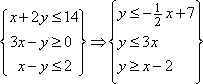
 Mean
Mean